Re-branding Le Papier Studio| Part 1
One thing I have learned from running Le Papier Studio since 2008 is that you can’t run a company the same way forever! The same rings true about your brand. The logo and branding that worked for us as a new, young company 6 years ago, required a second look as we became more establisheds. Whether you choose to make a few small adjustments or a major overhaul, your brand will benefit greatly from the change.
On today’s post, I will discuss the reason behind the decision to re-brand Le Papier Studio.

New and improved message
We are the safe keeper of a family’s memory. We strive to help evoke the magic of a moment forever through our silhouette artistry.
Our story is essential to what Le Papier Studio is today and although it will evolve with time, the beginning of it will never change. However, as we’ve grown and expanded as a brand, we had to take a look at how we continue to communicate our story and message with our customers and the world.
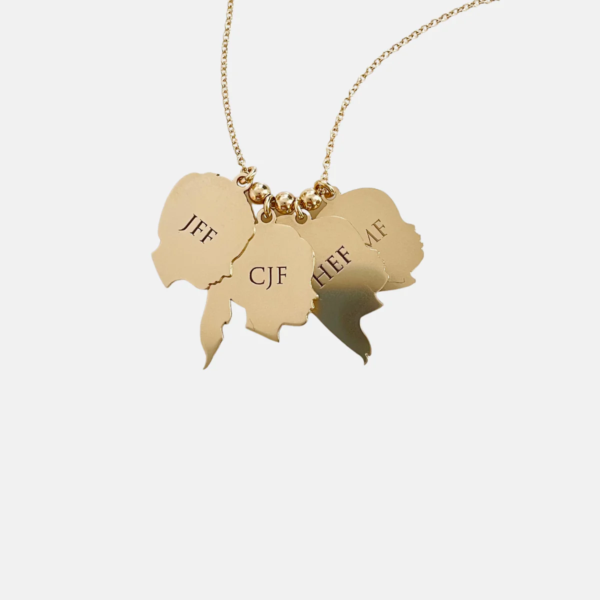
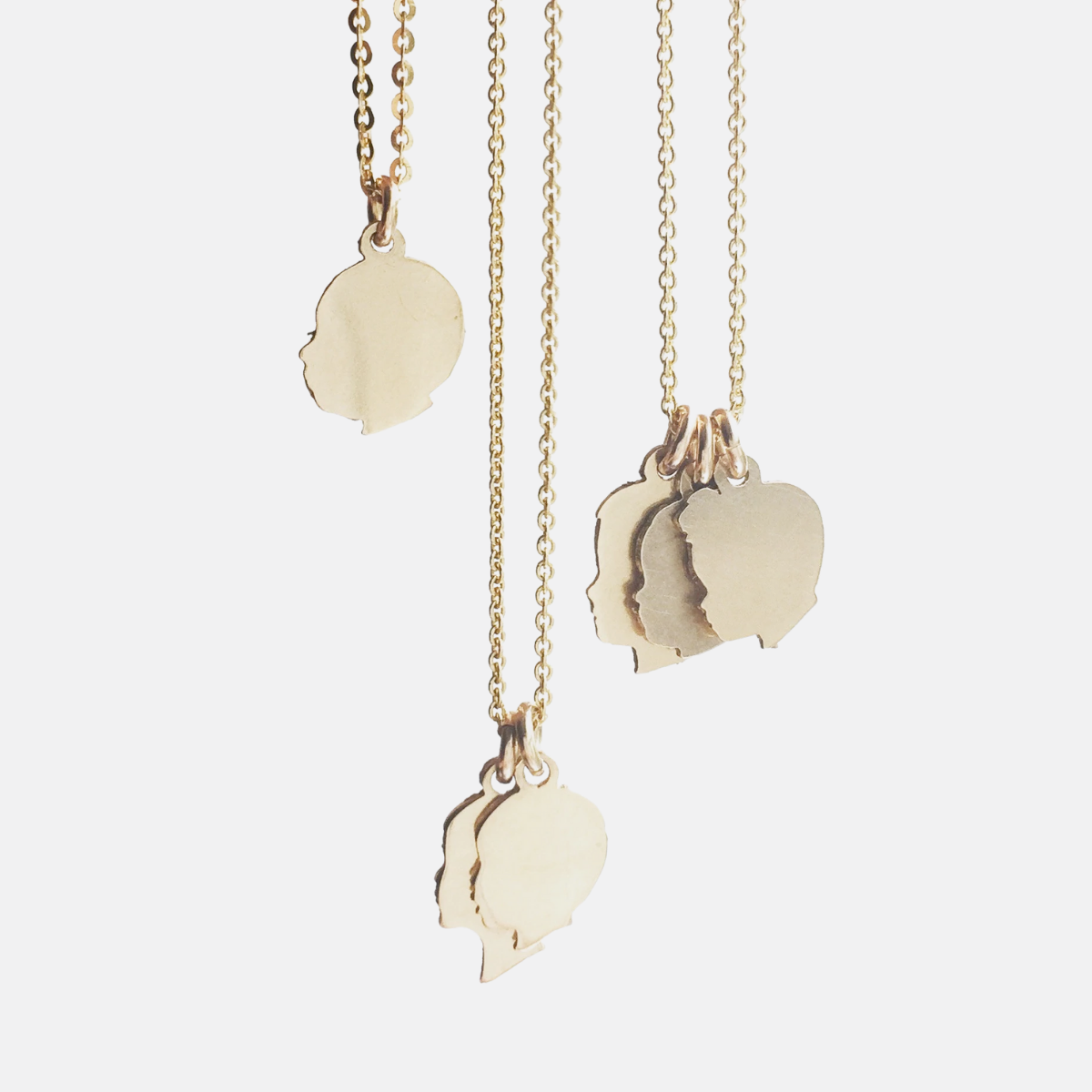
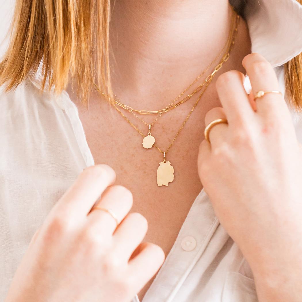
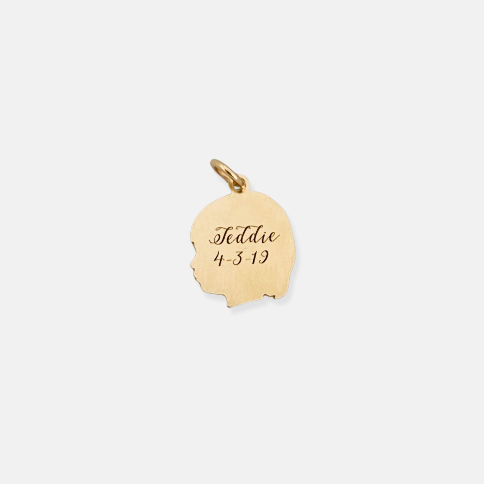
Questions like “who do we want to be?” and ” who we want to serve?” and “why do we matter?” evoked a lot of my thinking as I set down and analyzed the look of our new brand. We are and will always be a small, woman owned company. Le Papier Studio started by a mom in an effort to satisfy her creative passions while fulfilling an even higher calling, being a mom. We work personally with each and every customer, assisting them to turn their favorite family moments into one of a kind silhouette heirlooms.
We strive to capture and foster the happy, beautiful, and positive moments in life. We do this because we understand out of all the million moments the ones we treasure and hold on to are those that make us smile, inspire us, give us wisdom, and joy.
New and relevant branding elements
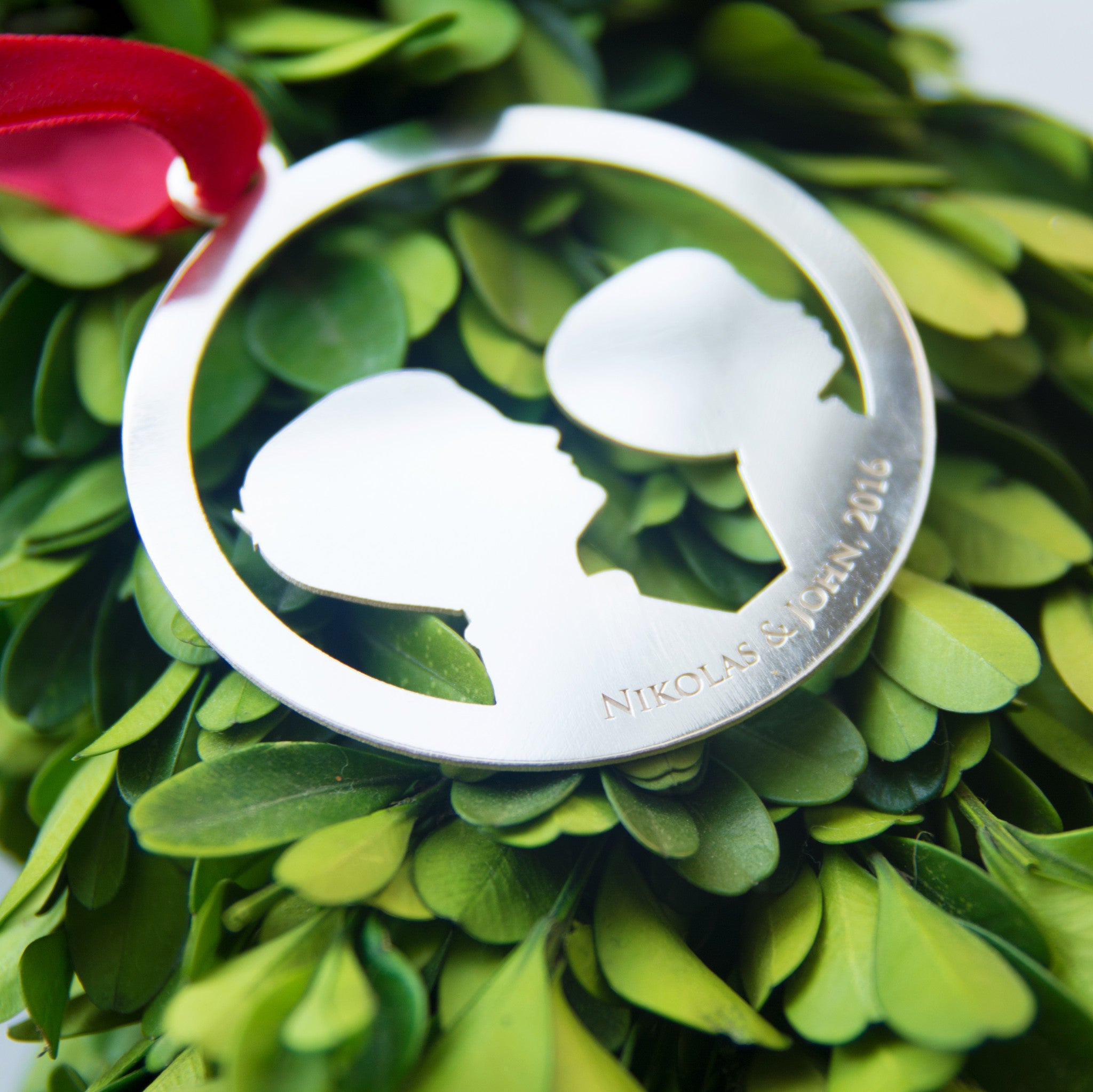
The single most important element of any company’s brand is its logo. As you may have noticed, we completely changed our logo. This decision was probably the most time consuming yet the most rewarding. I wanted the new logo to reflect the story behind the brand. A story that started with the birth of my first born son, Nikolas and through the years has continued to evolve with the addition of my other son, John. The two continue to serve as my muses. The new logo reflects simplicity of form – a black silhouette (of Nikolas) – and elegance – with “le papier studio” handwritten by the talented Laurel Essl.
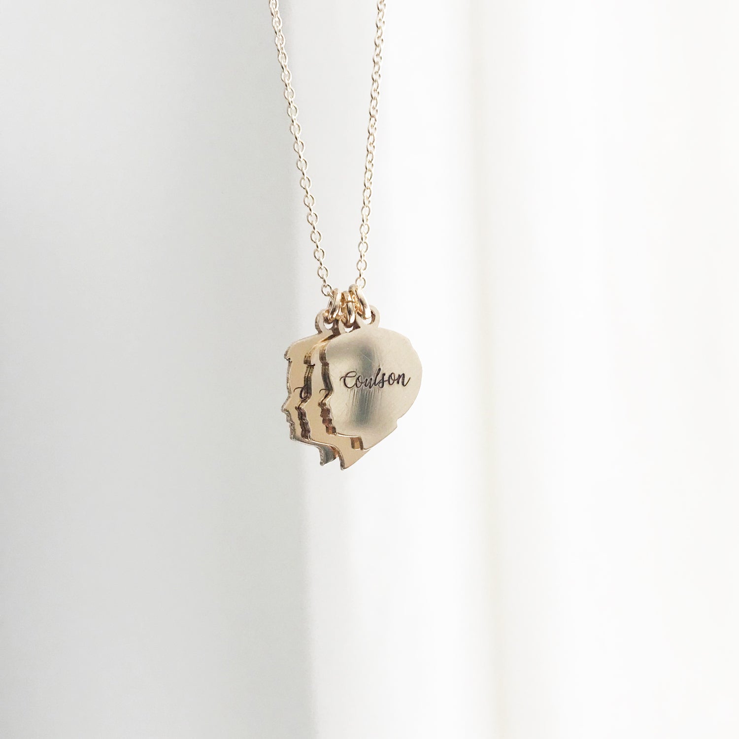
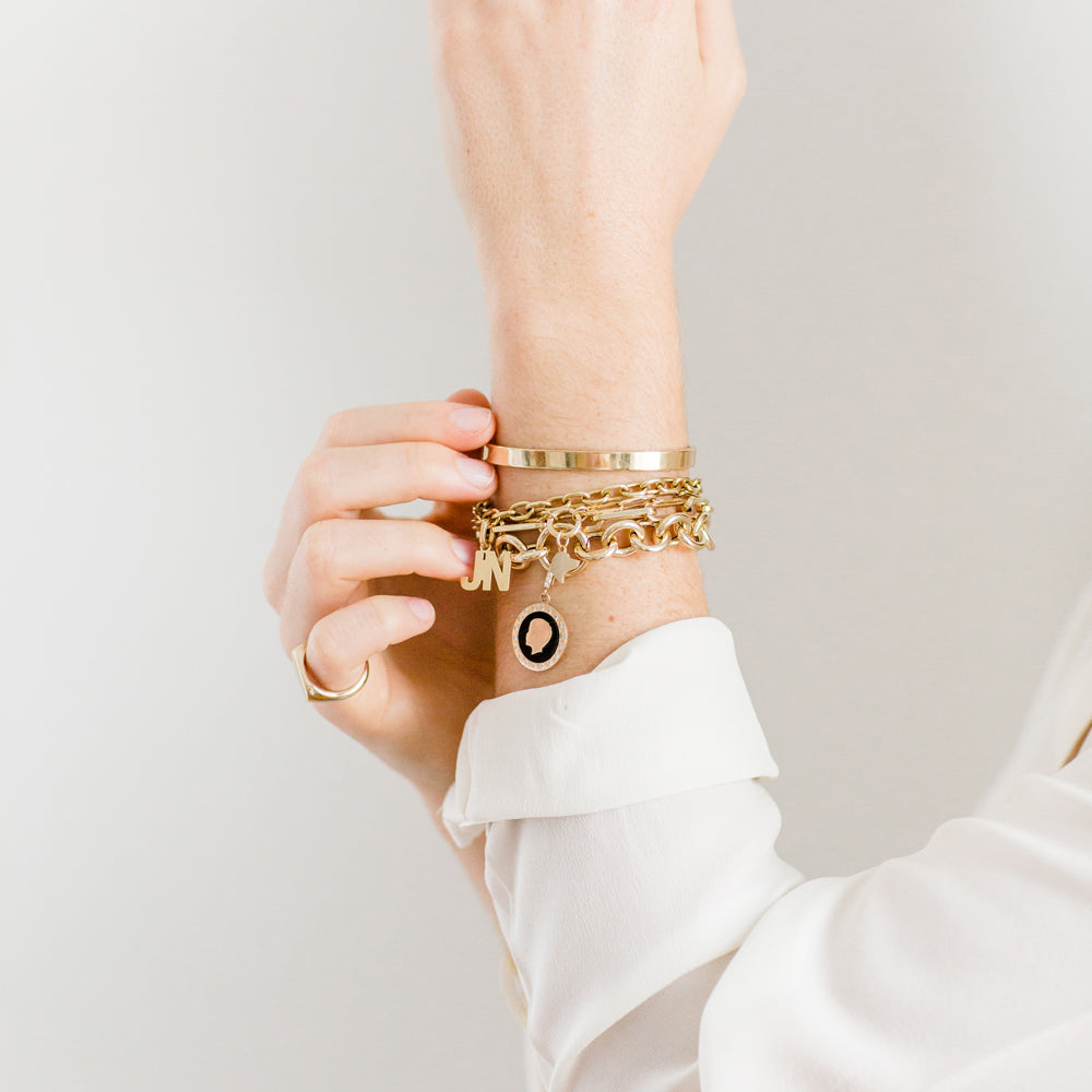
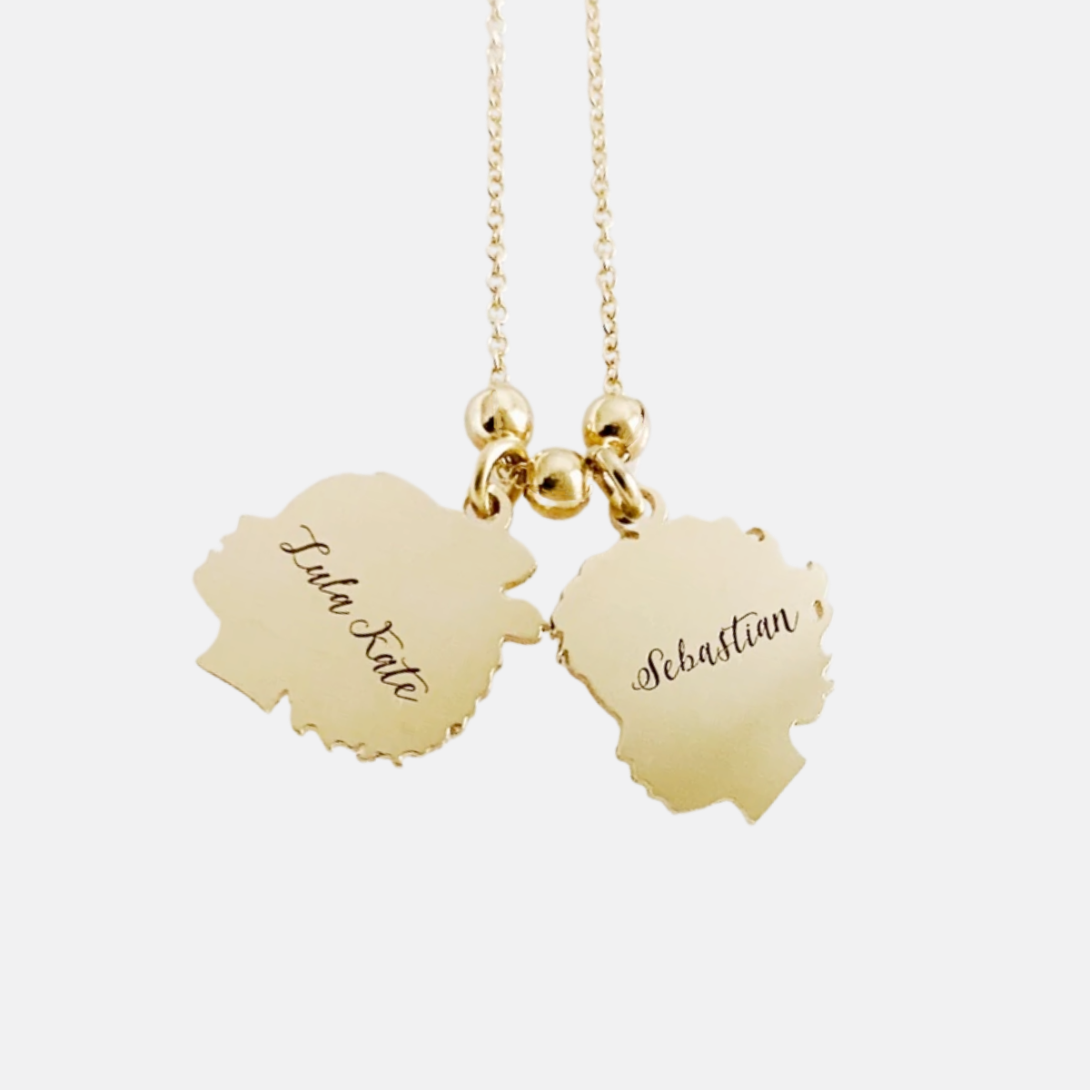
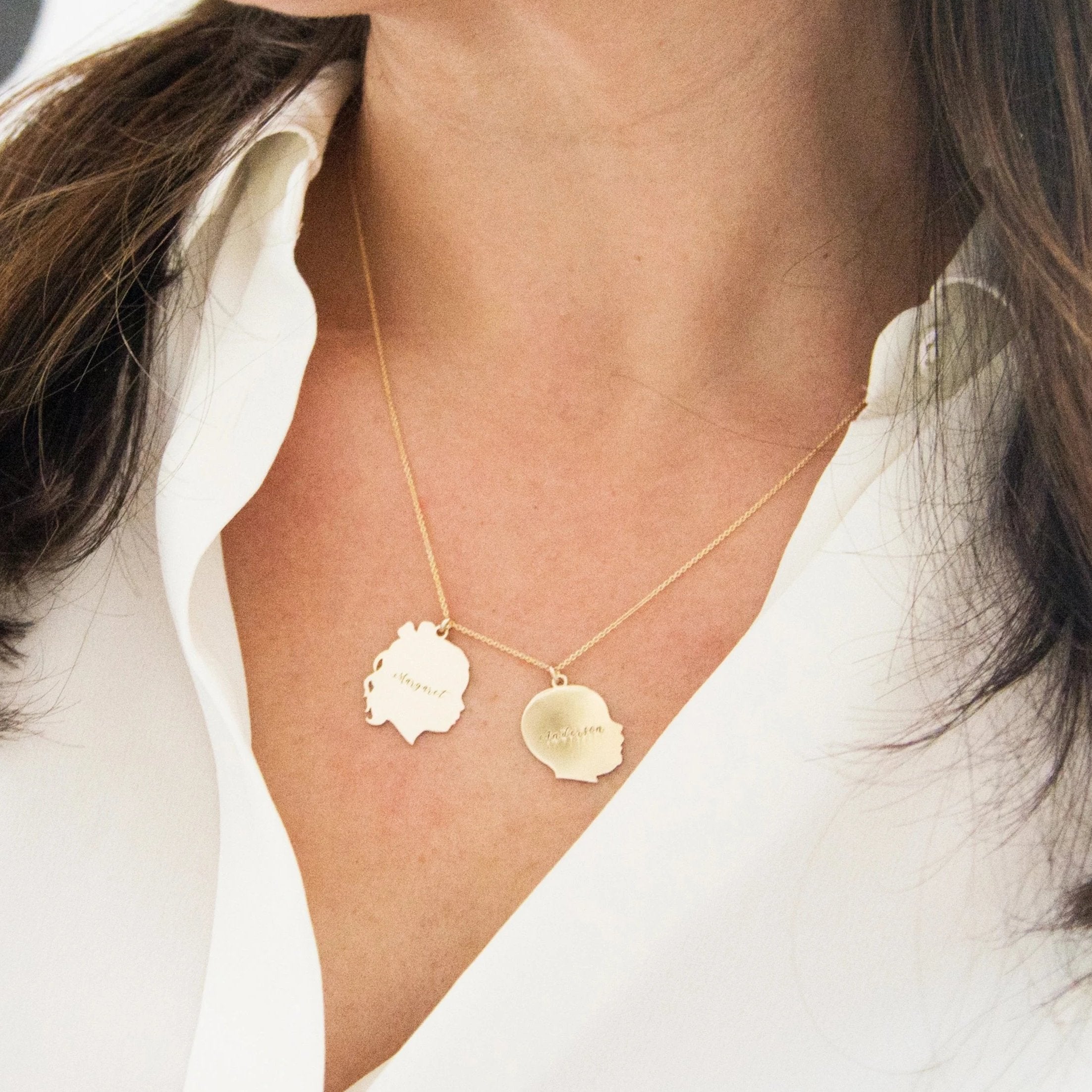
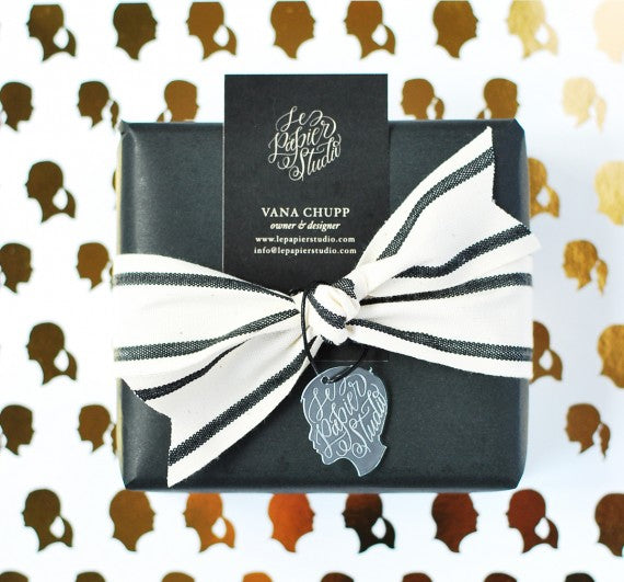
The logo is the main element on all other collateral pieces that make up the new branding. It is eloquently incorporated in the new business card, thank you note to customers, company stationery, jewelry packaging, gift wrapping, signature products and much more.
Along with the new logo, I settled on a new color palette and a few patterns – kraft paper, black, shades of white, beige, gray , stripes and polka dots and a touch of occasional gold.

Communication that reflects my brand
Besides the visual/graphic aspect of re-branding, communication is another key element. First impressions matter, right? Ever since I started selling my products, I’ve felt the need to not only satisfy my clients but also exceed their expectations. To me, details are so important and a huge part of what I do. So it was only natural that I would spend some time to come up with the few elements that would surely put a smile on ones’ face every time a package was received or a gift was unwrapped.

I hope you enjoyed Part 1. Let me know if you have any questions. On Part 2 I will discuss each element of the new brand in more detail.

