Re-branding Le Papier Studio| Part 2
Last week I wrote about the reason behind re-branding Le Papier Studio. Today I will go on to discussion each element of the new brand. Starting with…
The Website

The main element that changed is obviously the new logo. Located now on the upper left corner is the main element that catches your attention when you first come to the site. The background color changed from a light blue pattern to a faint gray that complements the products and doesn’t take away from them.

We adjusted the About Us page to reflect the new look and feel of the brand. New photographs of the studio and myself as well as a new copy now grace this page.

One of the most important pages on our site has always been the Custom Process and FAQ’s page. It explains our process in detail and provides a guide to placing an order with us. The new and improved page is more streamlined and also reflects our new brand.
New Brand Collateral
These are all the pieces that support our new brand: the stationery, business cards, packaging pieces, notes to customers etc.
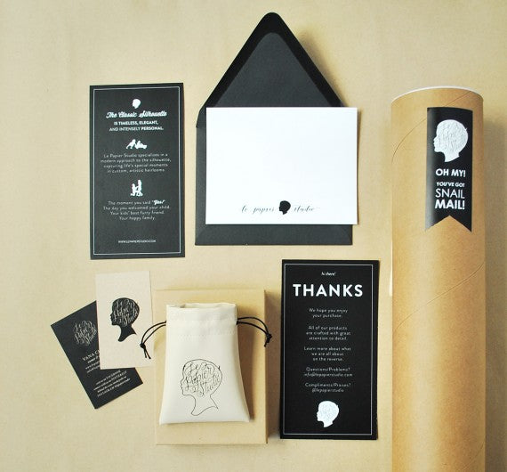
It was very important to me to create a brand that connect and tell a story, because what we do is preserve stories and moments through the art of silhouette. The business cards were updated with the new logo. We also added a little Thank You note to go out with each order. The note thanks the client for allowing us to create something special for them. It also (on the flip side) tells what we are and what we believe in. It is very important to me to continue to tell my story, inspire and leave a legacy to those who enter my life and the life of my business.
New Packaging


We wanted the packaging to reflect the product itself. In the case of our Clair Jewelry, we decided on a dainty glass bottle for the packaging. The bottle doesn’t take away from the dainty piece of jewelry – I think it was the perfect little “invention”.
We also decided to improve our fine jewelry packaging. The new leatherette pouches are the perfect way for our clients to store their Le Papier Studio keepsakes. Constructed of the finest material and craftsmanship they add the perfect touch to our brand. We decided on a pouch instead of a box, because we use know from personal experience how useful a pouch can be especially if you like to keep your favorite pieces together when you travel.

New Gift Wrapping

I am a firm believe in the art of gift wrapping. I’ve always looked for the perfect wrapping paper and card to go with the perfect gift. Our new gift wrapping complements our new brand so well. We settled in 3 wrapping paper colors – kraft, black and white, and 3 different cotton ribbons to go with each paper.

When coming up with these selections, we wanted to keep it simple and make it memorable. After all, the small details are what we all remember.
So here you have it! I hope you enjoyed this (rather long) second part of our re-branding process. If you have a question about anything, feel free to reach out to me via a comment below or email. If you love our branding and would like to discuss having your brand worked on, I am always thrilled to whip up something fabulous for my clients.


